Battle Bank & Savana Inc.
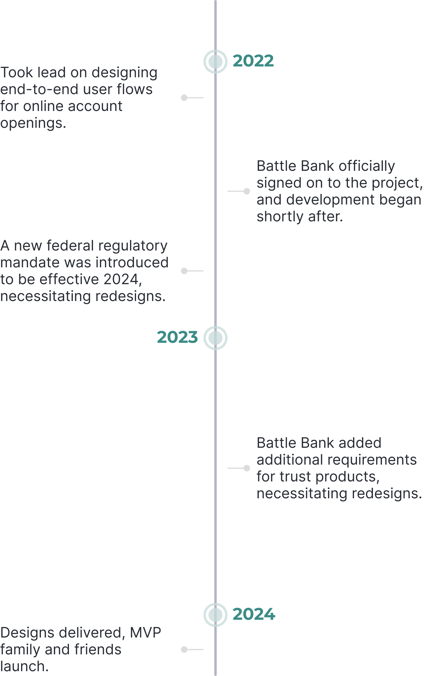
Savana set out to develop its first customer-facing online banking solution, having previously focused on enterprise-facing financial services. I was tasked with designing the account opening flows within the solution.
Savana partnered with Battle Bank, its first customer, to make the solution more client-focused.
Please note that certain details and information have been omitted or altered to protect the privacy and confidentiality of the organizations involved.*
PROJECT OVERVIEW
PROJECT goals
Reduce Application Drop-Off Rates
Simplify the flows as much as possible to minimize time commitment and boost application completion rates.
Compliant, Efficient, and Flexible
Design a responsive solution for both web and mobile interfaces.
DISCOVERY
My research was a combination of industry insights and market research.
Industry Insight
Through daily collaboration with the product manager who specialized in digital banking, I gained valuable insights into federal compliances and common pain points.
Market Research
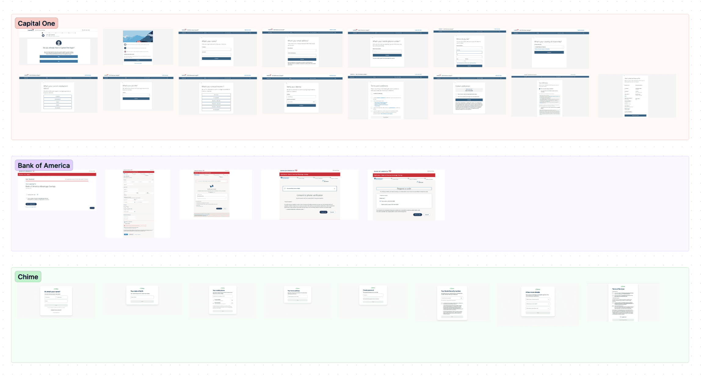
I analyzed online account opening flows from both traditional banks like Capital One and modern fintechs like Chime, ensuring our platform met user expectations and minimized confusion.
SKETCHES
Using insights from the product manager, competitive analysis, and project requirements, I started sketching with the goal of streamlining the flow as much as possible.
General vs. Guided
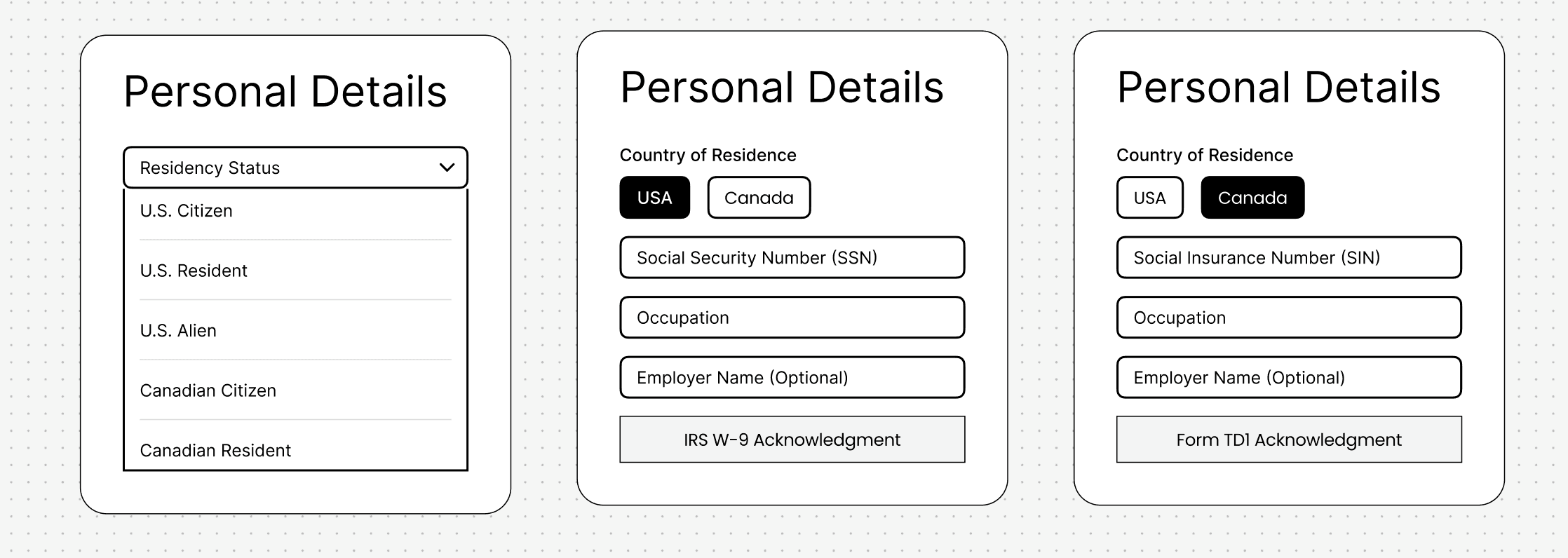
I initially added all the options listed in the requirements for each field. As I collaborated with the product manager and clients to better understand their customer base, I explored a more guided experience.
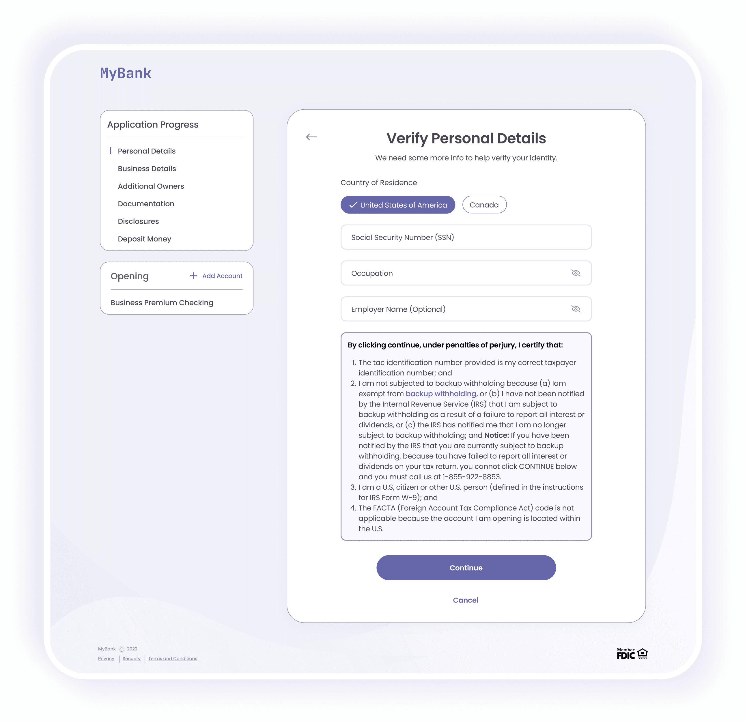
Through these discussions, I discovered that customers only needed a U.S. or Canadian residency address to open bank accounts with Battle, so I simplified the process by just asking for their country of residence. Based on their selection, I dynamically populated the relevant fields.
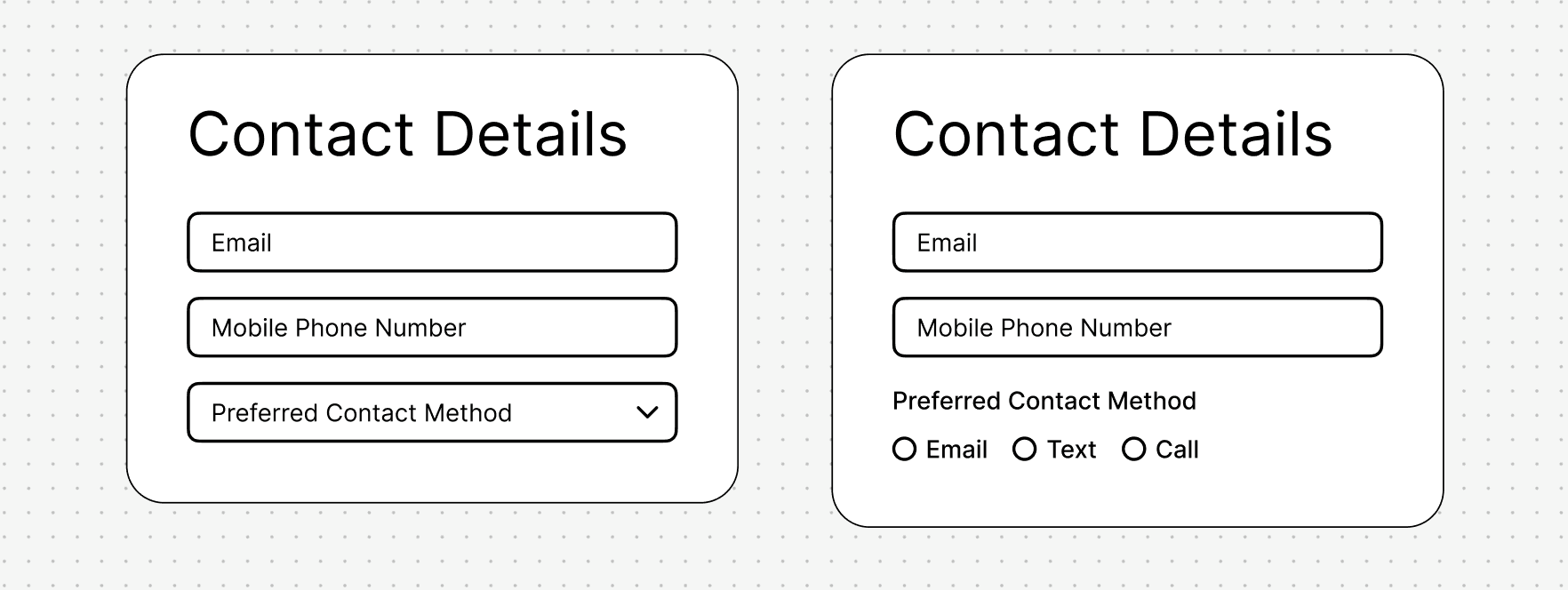
Dropdowns vs. Radio Buttons
I experimented with when to use dropdowns versus radio buttons. To minimize extra clicks, I chose radio buttons when there were fewer than three options, so users could see all choices right away without the need of the extra click to open a dropdown.
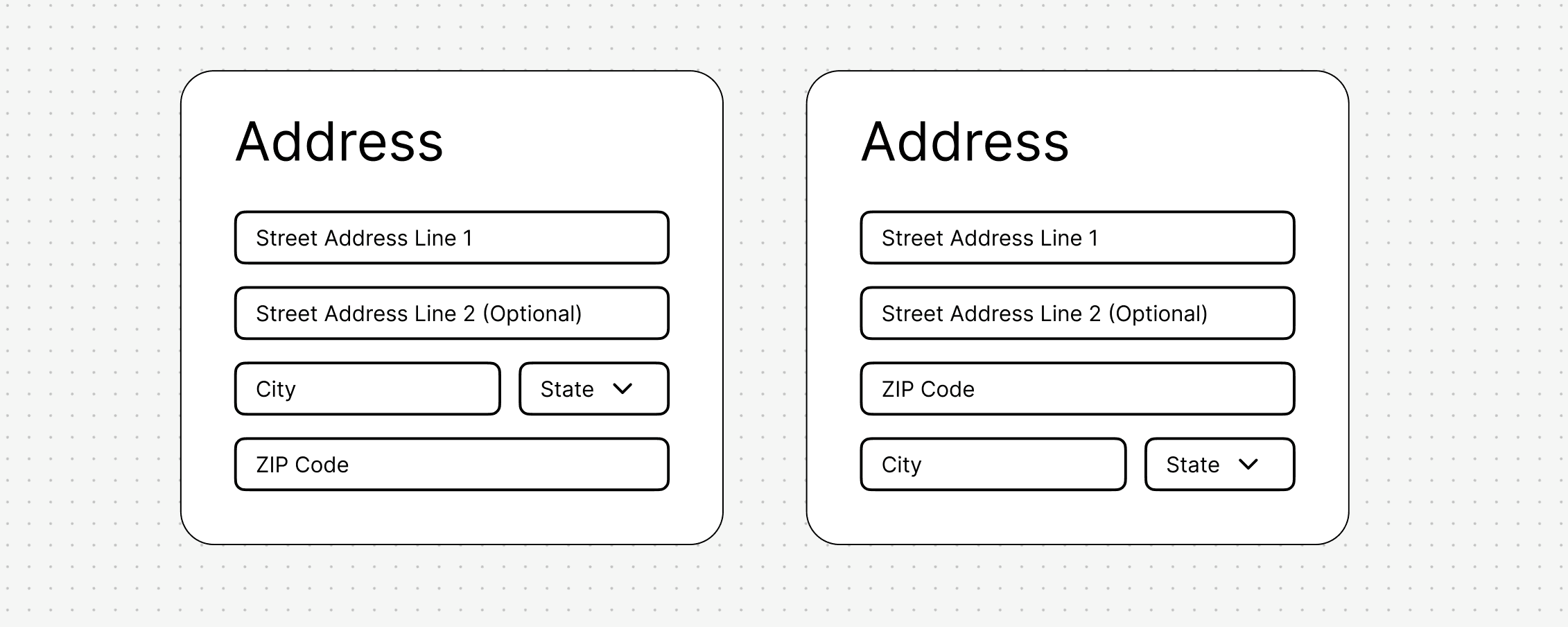
Familiar vs. Efficient
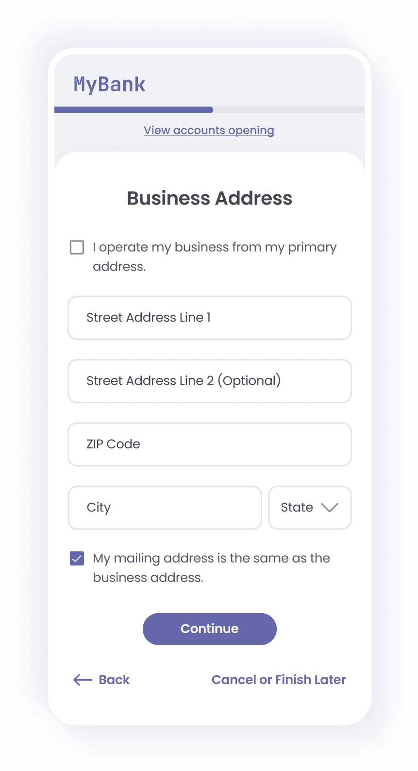
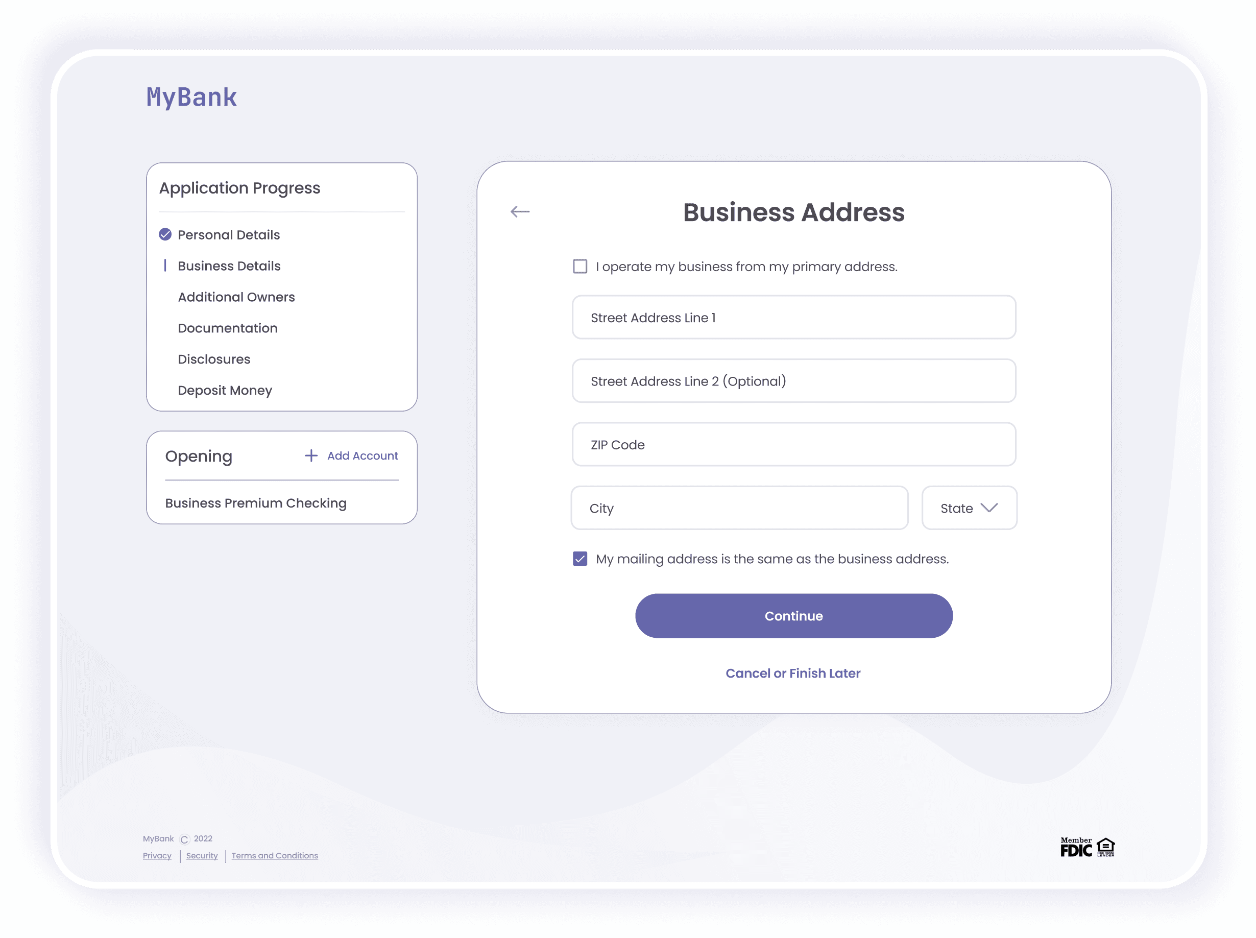
I started with the standard address field format, but I decided to move the zip code input above the city and state. This way, users only have to enter their zip code, allowing us to auto-populate the city and state fields. This makes the process easier but also helps reduce potential human error.
MAIN FEATURES
In addition to the careful attention given to the input fields, we introduced features that enable customers to complete their applications with greater ease and less effort, all while keeping their information more secure.
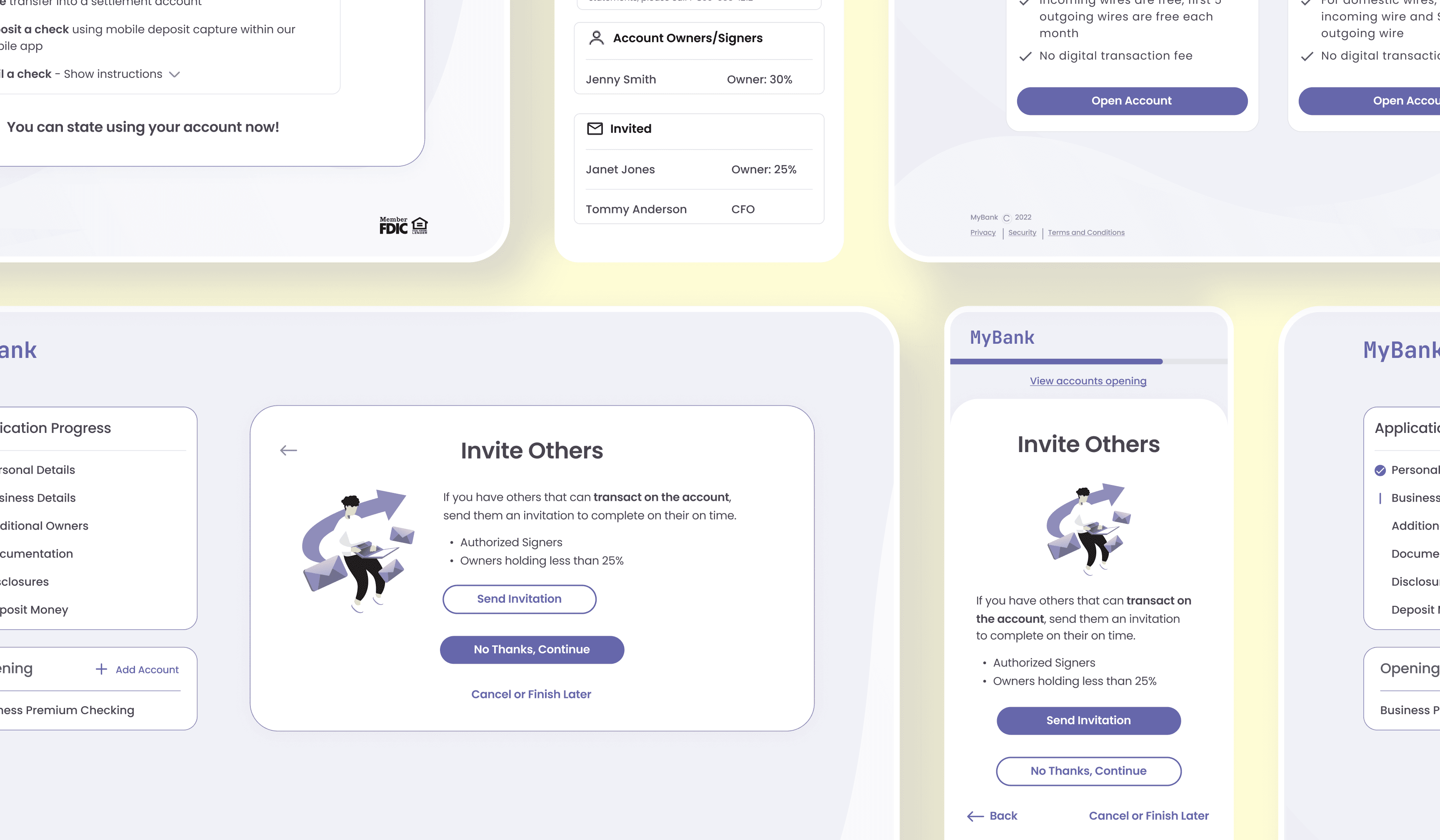
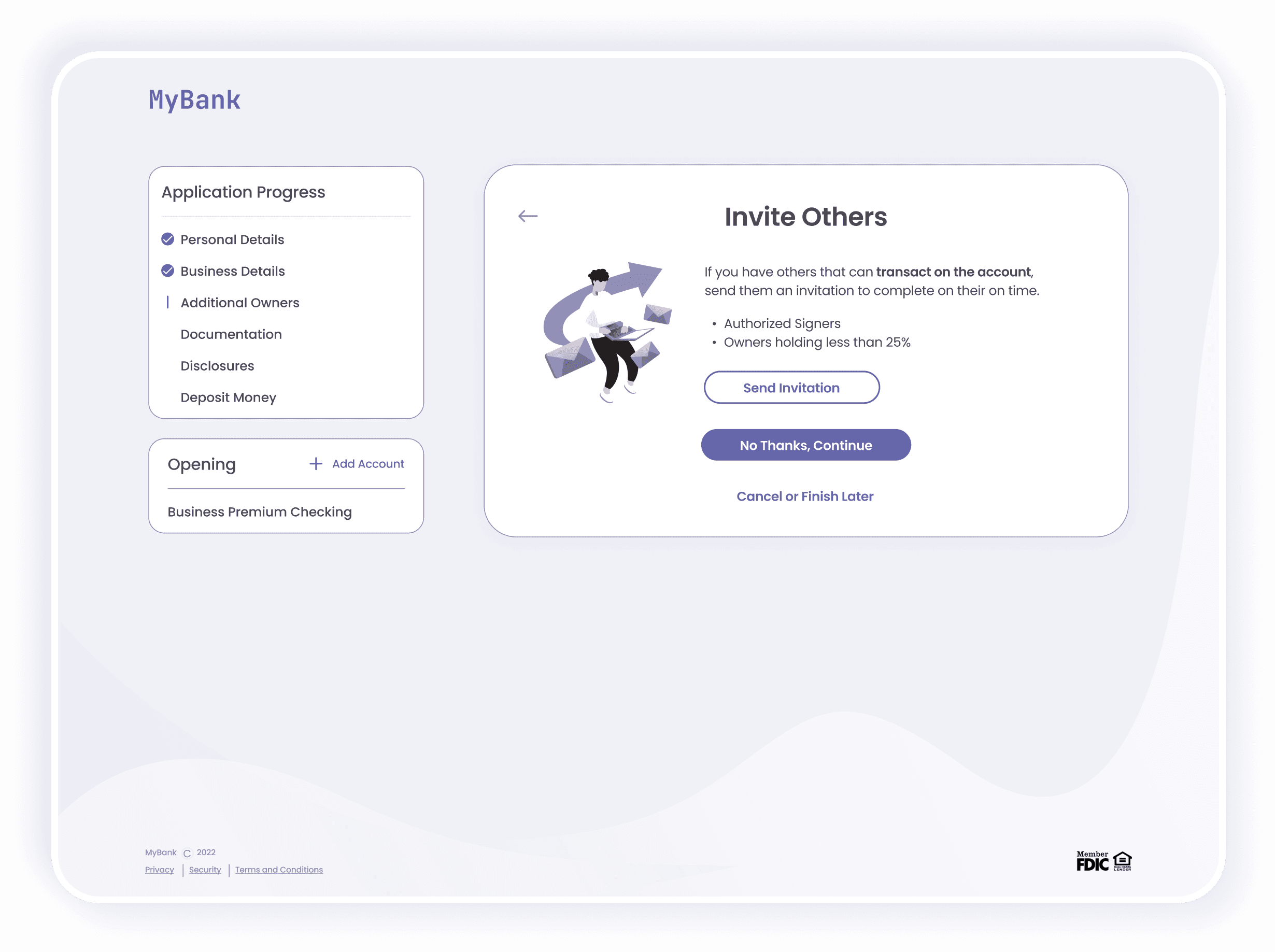
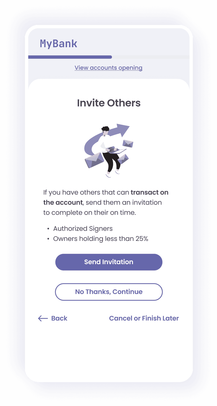
Invite Others to the Application
For accounts with multiple owners, we introduced a feature that allows applicants to invite others to complete their portion separately, enhancing efficiency and security.
Only Essential Information Upfront
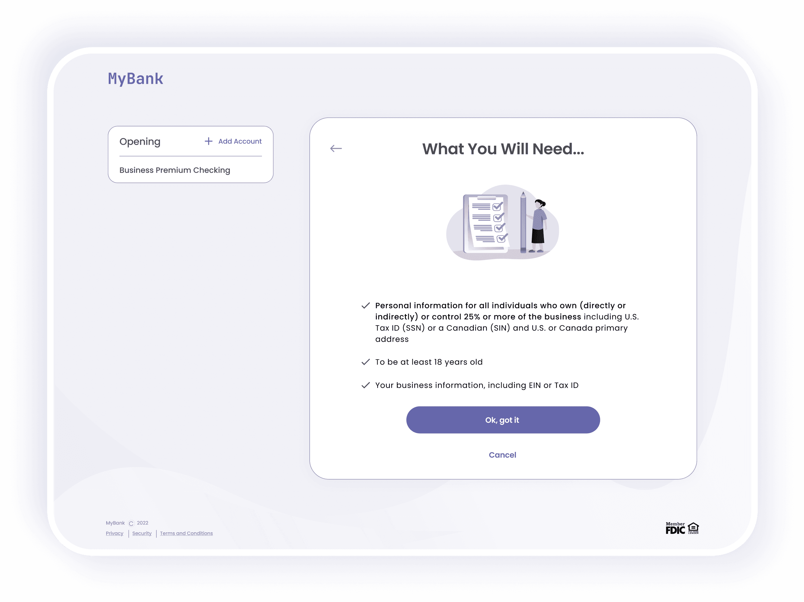
We simplified the account opening process by collecting only the regulatory-mandated information upfront, with additional supporting documents to be provided later via the online banking platform.
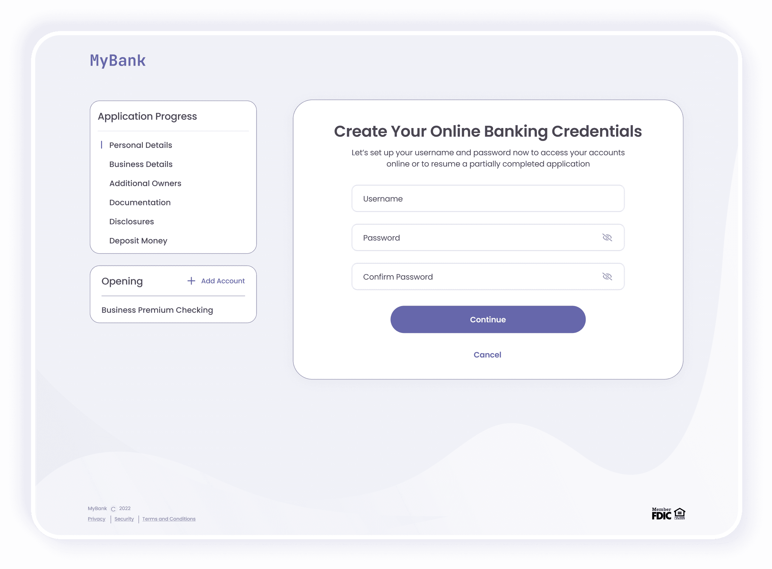
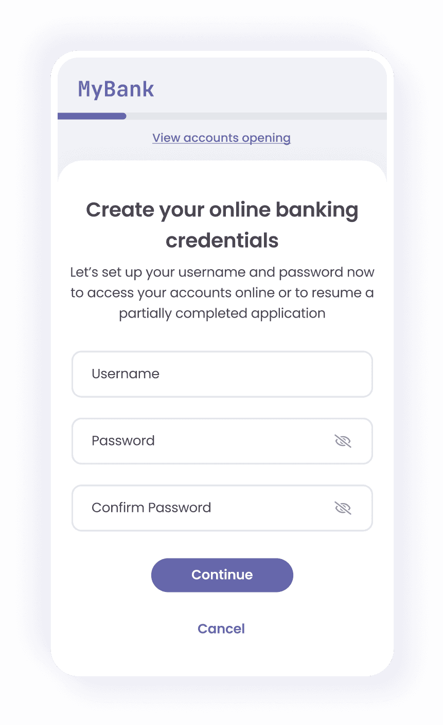
Online Banking Credentials
We asked customers to create their online banking credentials in the application flow, allowing them to easily resume the application and eliminates the need to create credentials after the account is opened.
Pre-Fill as Much Information as Possible
I used checkboxes to enable customers to autofill their personal information, reducing the need for repetitive data entry.
FLOW LOGIC
During the design process, we spent a large portion of the time planning out the flow logic by working through a multitude of possible user scenarios. The goal was to minimize user friction and maintain consistency across all account opening flows.
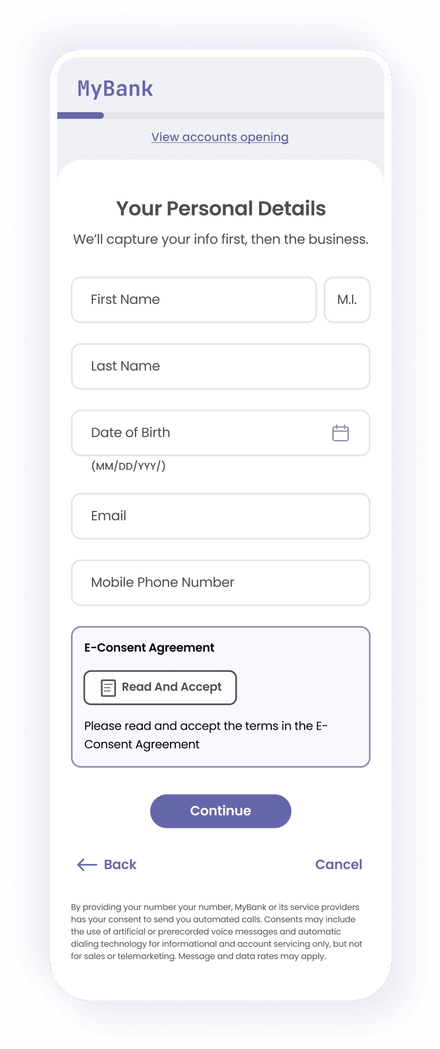
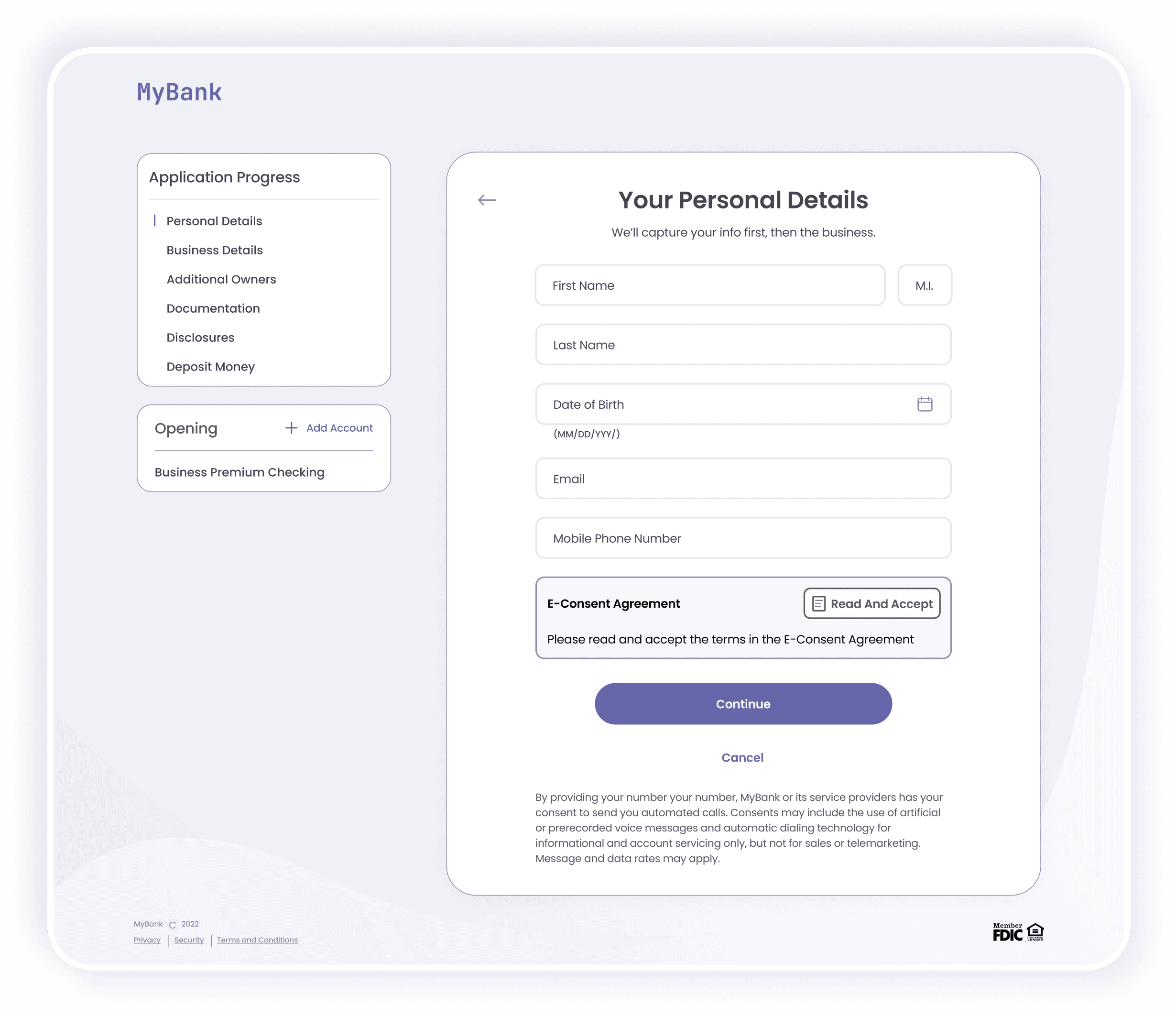
Why ask for personal details rather than business details first?
Most customers are more familiar with their personal details than business details and can enter them quickly.
If a customer fails KYC (identity verification), resulting in a hard stop in the flow, they avoid wasting time searching for information that may not be as readily available.
Ensure consistent flow across all account opening processes, as a primary user is required for all banking products.
Why ask to create credentials here?
We’ve collected all the required customer details to run KYC. If customers passes KYC and create their online credentials, they can resume their application at any stage at a later time if needed.
CHALLENGES AND REDESIGNS
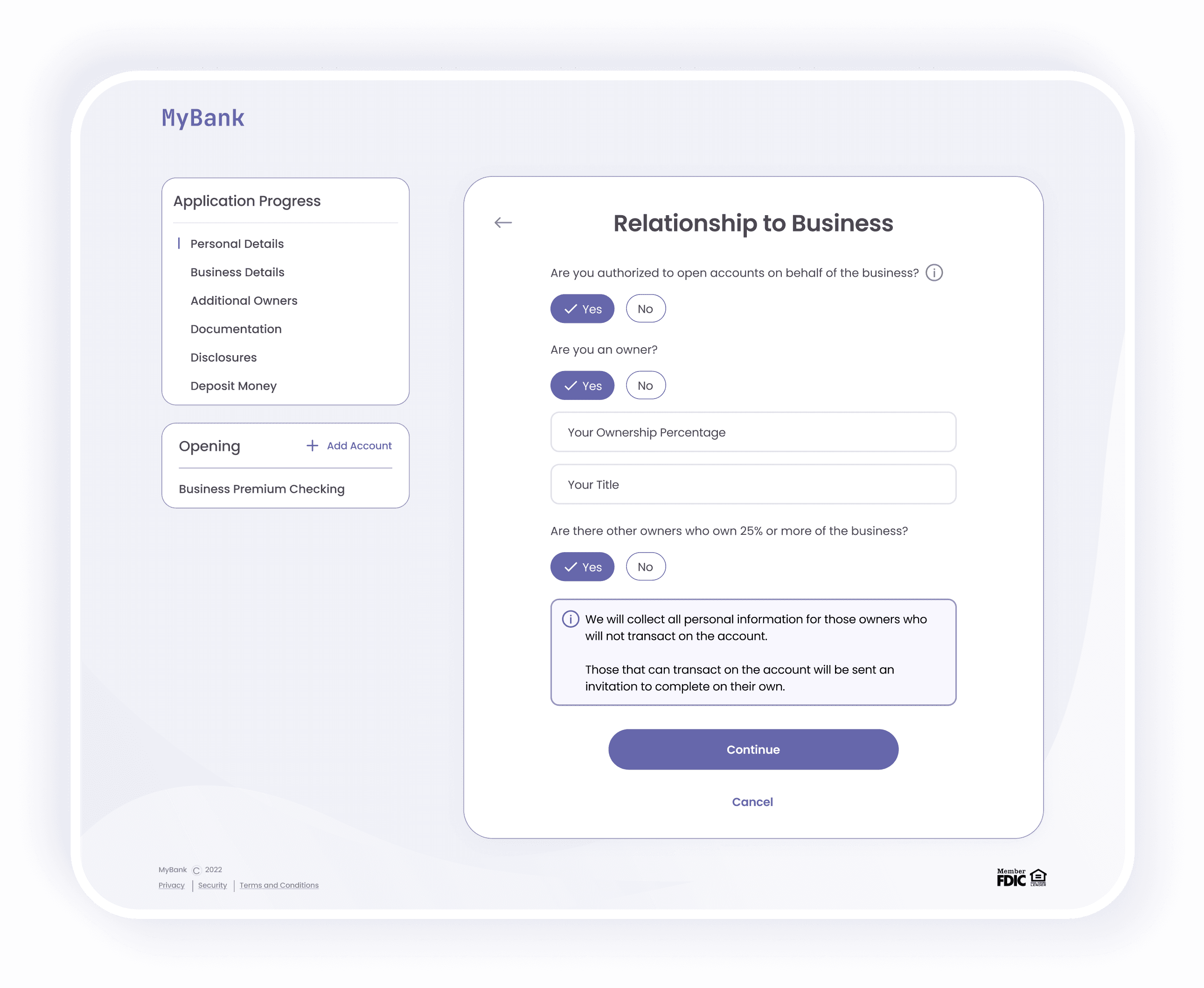
No journey is without challenges. Regulatory hurdles and evolving client needs presented compliance and design issues. Since both challenges required understanding the customer’s role in their business or trust, we used similar redesigns and flow logic to address them.
New Federal Mandate
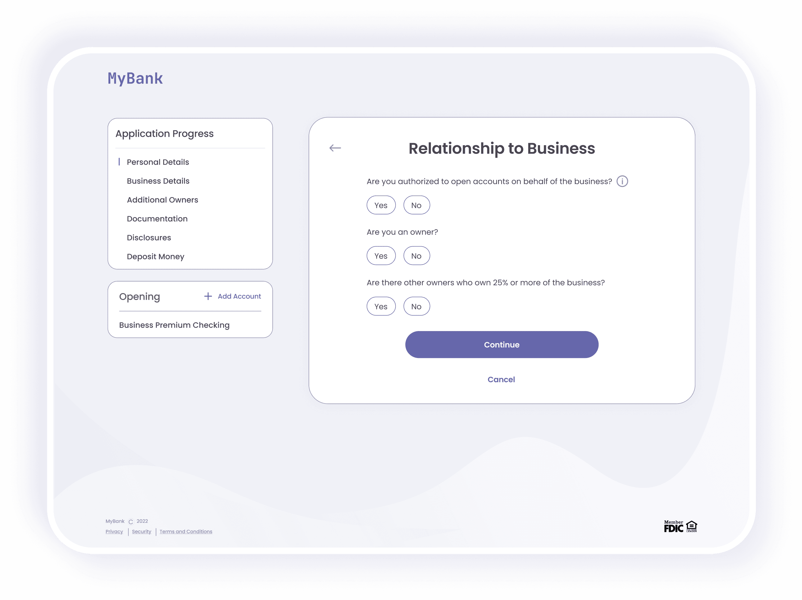
A new federal mandate required reporting any business owner with 25% or more ownership for business accounts by 2024.
Additional Client Requirement
Battle Bank introduced a requirement to include at least one grantor and trustee for all trust accounts.
OUTCOME
During usability testing, one participant successfully opened a new account as a new customer in under four minutes, validating our goal of streamlining our flows and reducing the time commitment for account openings.
The design updates were implemented to align with new regulatory and client needs, and the revised designs were handed over for full development. Our family and friends launch was a success, receiving great feedback.
REFLECTION
This project was a valuable learning experience and a large professional milestone for me. It marked my first major long-term UX endeavor, spanning two years from concept to development.
Collaborating with clients and various teams, managing handoff processes, and overcoming developmental hurdles provided valuable learning experiences. A key lesson learned was the importance of involving a developer early in the design process to address technical complexities and set clear expectations for the development team.
